Hello,
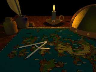
if you can give me some hints how to improve this scene I would be really
glad. I would like to give it a more "dusty" and "used" look - but I have no
idea how to do so. I don't like the texture of the candles "body" (which is
just rgb 1). And I'm not sure if the composition of the scene is good (even
if the map is quite important).
Credits: The helmet is from William D. Hayden.
Thanks,
Marc-Hendrik
Post a reply to this message
Attachments:
Download 'feder.jpg' (58 KB)
Preview of image 'feder.jpg'

|


![]()